TDA Connect
A community platform for TDA program graduates to foster their community and access vital resources.
Overview
After completing The Dream Academy (TDA) program, many graduates (LGBTQ+ Refugees) use What’s App to stay connected by sharing interests, support and resources. However, as TDA program grew, the functionality and features within What’s App became limiting. Our client, Safe Space International (SPI), saw the need to develop a community platform for TDA graduates to engage with the larger community, and to obtain and share resources for all to access.
Challenges
Users are highly concerned about online security as they often face discrimination and prosecution.
Users live in country with low-bandwidth, low-data and often share devices with other users.
English is a second language for the users, appropriate content language level is needed.
SPI has limited resource in monitoring & governing platform activities, relying only on a few country directors for support.
My Role & Team
I co-led one of the two design teams with a team of 5 designers. I was tasked with planning design road map, facilitating design sprints, collaborating with other team leads and overseeing the client design presentation in a cross-functional team of project owners, product strategists, UX researchers, UX writers and developers.
Project Deliverables
Phase 1 Design Iteration
Identify potential usability issues to improve user experience.
Apply research & useability testing insights to refine design solutions.
A New Feature - “Groups”
Create a space where users can share interests and passion projects on a deeper level.
Empower users to support each other with advocacy initiatives, job opportunities and more.
Design System Update
Create a separate design system file, a living document, to be utilized by two design teams.
Update components and UI elements for a more efficient design process.
Design Iteration
Phase 1 Features:
Sign Up /
Onboarding
Social
Feed*
Profile
Management
Settings /
Notifications
* Our team iterated on all Phase 1 features. However, I want to highlight Social Feed as the design focus area for this case study.
Heuristic Evaluation
01
Utilized Jacob’s 10 usability heuristics to identify any potential usability issues and areas for improvements for ALL Phase 1 features (mobile and desktop).
Prioritize our heuristic evaluation findings using a prioritization matrix based on design feasibility and client priority. We then categorized the “high priority-high feasibility” findings by focus areas to hone in on the improvements for each feature.
Prioritization Matrix - High Priority/High Feasibility
Some examples of the Social Feed feature findings:
Post Feeds/comments - Need visual distinction between comments within a post and across the feed.
Feed/home page (desktop) - Need distinct purposes for the right and left sidebars. Clarify the usage differences between the sidebars.
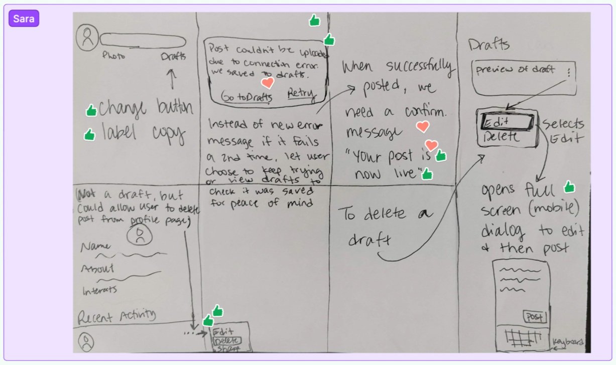
Saved Posts vs. Saved Drafts - Need better copy language, too similar and confusing.
Kabab menu - Need consistent actions for the post and comment areas.
Error message - Post loading error message. Go deeper with another error message if “retry” still not working.
Ideate & Refine Designs
02
Reframing challenges into opportunities! Generated the “How Might We” (HMW) statements - key user-centered questions that would facilitate the formulation of our design solutions.
A few HMW’s for the Social Feed feature:
1
How might we make the post creation process more seamless (without the modal)?
How might we arrange comments in a post to encourage user engagement?
2
How might we provide clarity for users on whether or not a post was saved, published, or in the midst of being saved/posted?
3
How might we allow users to see their drafts and easily revisit them to edit or delete?
4
Affinity mapped the HMW’s to determine key areas to ideate with Crazy 8’s and formulated design decisions with the emphasis on clarifying information and CTAs and simplifying operation and steps, while making sure there’s consistent look and interactions of functionality across the flows.
User Flow
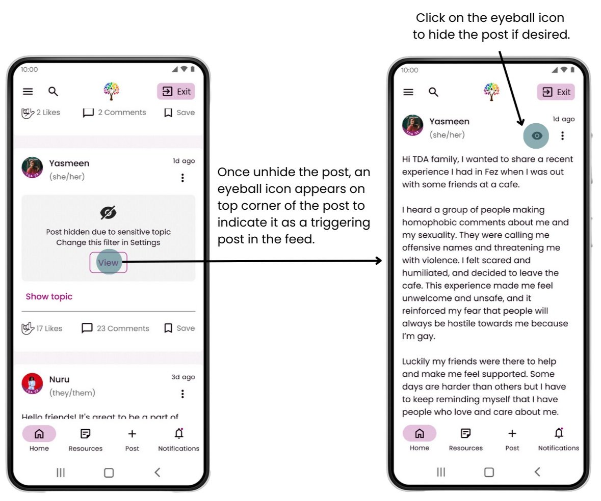
Focused on creating a post process for the user with sharing options and a sensitive topic indicator which allow the user to feel safe and have control over managing triggering topics. At the same time, any error due to low bandwidth is clearly indicated to reduce frustration.
Site Map & Navigation
Updated the site map and enhanced navigation menu with the addition of Groups and Resources features while leaving placeholders for potential features to be developed in future phases.
Mobile Nav. Menu
Desktop Nav. Menu
Wireframe & Prototype
03
Built design solutions using existing UI elements, content and design wireframes from Phase 1, and fine-tuned our design into high fidelity wireframes. To further solidify the design and prepare for usability testing, we collaborated with the content team to update the content to be more relevant and easier to understand for our users.
Simplified top navigation bar with accessible “Quick Exit” button.
Focused on “Write a post” to encourage engagement.
Reduced post visibility options to simplify the task.
Decluttered the comment writing area and muted the background to focus users’ attention.
Test & Refine Prototype
04
Uncovered challenges our target users may face when interacting with our proposed platform prototype. Remote moderated usability tests were conducted. Overall, users found it easy to navigate and perform the required tasks. However, we did uncover some issues pertaining to “writing a post” along with other areas. We only addressed issues we can affect easily for this phase due to project time constraint.
Testing feedback:
Not straightforward to users how selecting a sensitive topic will affect their posts
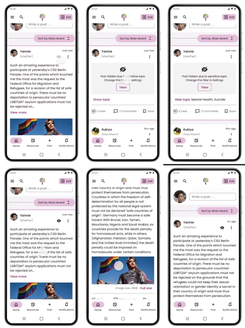
Adding the ability to see the sensitive topic/topics chosen by the user/poster.
Eyeball icon over the sensitive post to re-hide the post and indicate it has triggering topics.
Final Prototype
05
Write & share a post with an image to the TDA community
Create a post
Apply “sensitive topic” filter to triggering content when needed
Ability to hide/unhide triggering content in feed
New “Groups” Feature
Feature Goal:
To create a space where users can share interests and support each other with advocacy initiatives, job opportunities and more.
User Needs & Goals
01
Competitive Analysis
Utilized the competitive analysis from UX Research team on other social media platforms. We combed through the SWOT analysis and came up with Similarities, Learnings and Opportunities to formulate user interview questions with the goals of:
Understanding what groups are they currently involved in:
How do they use it now? What are their needs, goals and pain points?
What is their current level of involvement in groups?
Gaging bandwidth for community contribution to create or moderate groups.
How can we build trust with the anonymous feature? Assuming this feature is important to our user community?
Understand how they have viewed the groups feature in the past (Good vs bad experience).
User Interview Insights
Based on user interviews, we discovered some key user goals:
Security & safety are very important when interacting and participating in a group.
Anonymity isn’t always straightforward for the user. They see its importance for some issues but also concern about the potential for abuse.
Desire for private groups that allow for more privacy and deeper engagement.
Many users have passion projects that need support and can enlist and share with other TDA graduates in the community.
Ideate & Create
02
How might we make it easy for the users to create and organize their own groups (public & private)?
How Might We?
1
How might we make it easy for the users to join/leave, invite others to groups, or request to be part of a group?
2
How might we display various groups in a clear, relevant, and organized way for ease of discoverability and browsing (including passion projects), without information overload?
3
How might we incorporate some option for anonymity without jeopardizing safety?
4
How might we ensure there are measures/ actions/ discipline in place if a user posts something inappropriate or does something to threaten safety and privacy in the group?
5
User Story
To prioritize our design solutions, we decided to focus on the user story for Group Creation:
As a TDA graduate I want to create a new group based on my interest so that I can engage with people with the same interest or work together on a passion project.
User Flow
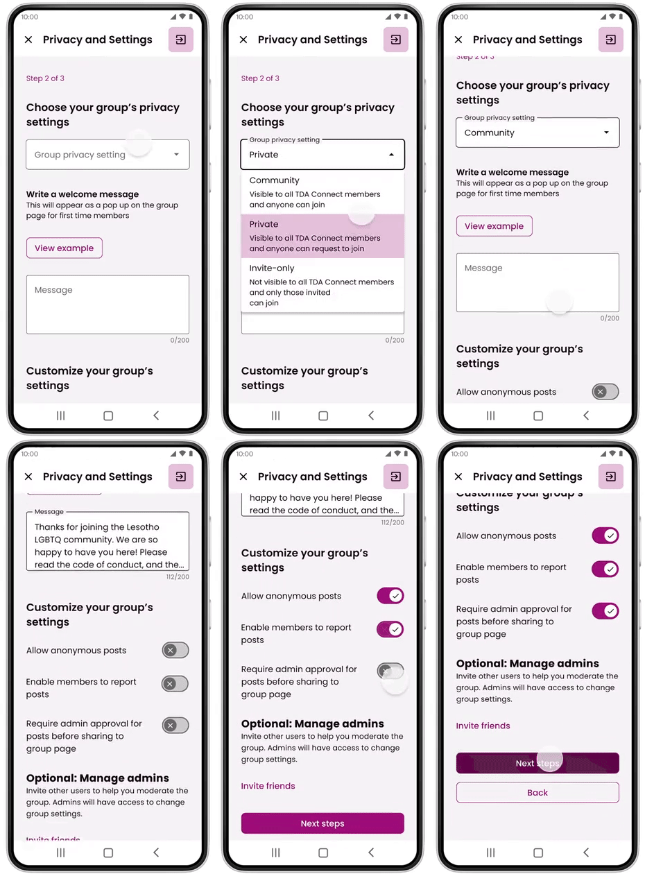
To make the group creation process easy and non-intimating, a step-by-step process allows for successful creation. To connect and bring people into the group, the user can share and promote their group feed content.
Inspiration & Sketch
Each designer brought in design interfaces and inspirations from other service platforms for the team to critic and generate new ideas from. We performed the Crazy 8’s challenge to quickly generate a variety of ideas to share and discuss. We sketched out some of the solutions for the team members to vote on.
Wireframes & Prototypes
03
Built design wireframes based on our solution sketches using platform UI and updated design system while collaborating with the content writing team to provide appropriate and inclusive language for our user community.
Group - Home Page
Create A Group -
Step 1
Groups - Menu
Create A Group -
Step 3
Create A Group -
Step 2
Design System Updates
To streamline the design system for a more efficient design process to be utilized by the design teams
Update Goal:
A design system based on Material 3 was created and utilized by one design team in Phase 1. Since the project scope for this phase required two design teams, our design team was responsible for establishing a more versatile design system to be utilized and updated by both teams. With enhanced interactions and new features for this phase, we want to make sure the design system is efficient , consistent and relevant for this project phase and beyond!
Review & Realign
01
We decided to build upon existing UI elements and update the design system based on:
Efficiency in component usage and design.
New components and patterns per design iteration and new features.
Updates on M3 elements such as Kabab/Hamburger menu, Navigation bar/drawer, etc.
Update & Create
02
With usability, consistency and efficiency in mind. We have drastically reduced the number of component instances from Phase 1 by 372! while maintaining the product functionality and usability. It was a collaborative effort within and across the design teams on creating and deploying new design components which offer a faster and smarter way to design.
Button Component - Old
Button Component - New
Design System
03

Final Thoughts
Key Takeaways
Coming into the project, there were some unanswered questions and design challenges that our design team had to tackle to support user needs and our client’s mission. As a co-lead of the design team, I have gained valuable knowledge, skills and experiences with a few key takeaways:
Team Development - With a 8-week project time frame, we had to quickly build up a cohesive remote team to take on tasks and collaborate throughout design sprints. In addition to open communication and team building activities, my co-lead and I implemented a voting system, utilized Kanban board and hosted office hours to advance the progress of our project. I also mentored the designers to support areas they want to grow in their design journey.
Working with uncertainty and constraints - We had to work through uncertainty with assumptions, and pivot away from a feature as we learned more about limited client resources. The low-bandwidth environment for our users was a key constraint and we worked closely with the development team to understand the impact and adjust our design accordingly.
Collaborate early and often - For this the project, we added the UX content and development teams to begin the implementation of the platform design. We worked closely across teams, creating liaisons to attend each other’s team meetings and hosting check-in/feasibility meetings for more specific feedback. Many insights from other teams were impactful on our designs and it is important to get the feedback early in the process to work more effectively.
Future Steps
We were able to build up the basic framework and MVP per client’s priority and goals in this phase.
Going into the next phase, there are updates that we didn’t get to implement per usability testing insights, and other refinements on areas that need further client directions.
Updates per usability testing results. Specifically on areas that need design realignment per user priority such as sensitive topics and post visibility placement when creating a post.
Enhance platform security. The team began to engage with some security experts and would further investigate ways to ensure platform security given the sensitive nature and the political landscape of user locations of the platform.
Usage of tags in lieu of search. Due to bandwidth limitations, global search feature is not feasible, only specific to the page that the user is browsing in. The usage of tags can help filter and narrow down the feed posts to be more specific to user needs. Further clarification from client needed on the utilization of tags.
Low bandwidth mode. Use the existing designs for each flow and design a low bandwidth mode for the user to enable it where the screen will be mostly text and images will be replaced with a text description of what it is (ie. image alt. text).
Refine & Improve. There will be further discovery of design debt and user needs from usability testings in the next phase which would aid the refinement for the groups feature and improvement for the design system.


